With a new website and rapid growth, read how we decoded Studio McGee’s marketing strategy.
Studio McGee launched a new website earlier this year – and everyone is drooling over it. Including me.
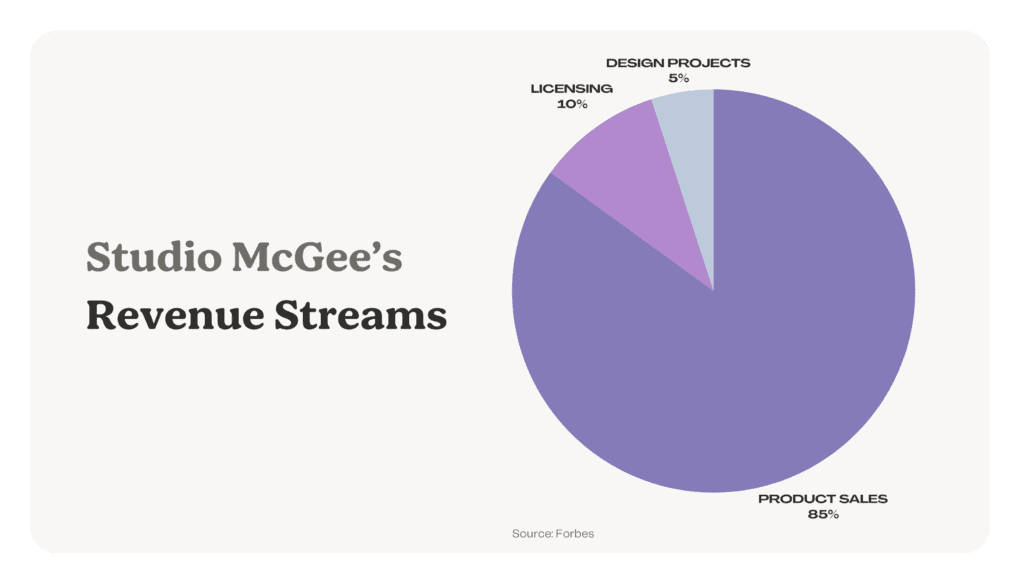
Founded by a husband-and-wife duo, Studio McGee first opened as a design firm in 2014 and two years later launched an e-commerce site called McGee & Co. Their e-commerce has grown so quickly that it’s eclipsed the design studio. According to Forbes, the company made $59.7 million in revenue in 2020 – 85% from product sales and only 5% from design services.
If you’ve been following them, you know Shea and Syd McGee have built their entire business online. First on Instagram, and now on Google, YouTube and Pinterest. They’ve done it all organically with almost no paid marketing. If anyone knows how to attract and convert online strangers into paying customers, it’s the McGees.
Looking at their new website with my “marketing eyes,” I see a website that isn’t just beautiful. It’s also persuasive. This website had a thoughtful marketing strategy before it was designed. Whether or not you’re a fan, fundamental marketing principles contribute to their success, and anyone can learn from them.
Today, I want to pull apart Studio McGee’s marketing strategy and show you what I see. Maybe it inspires how you market your firm online.
The Studio McGee Website
According to SEMRush, the Studio McGee website gets between 200k and 300k monthly visits.
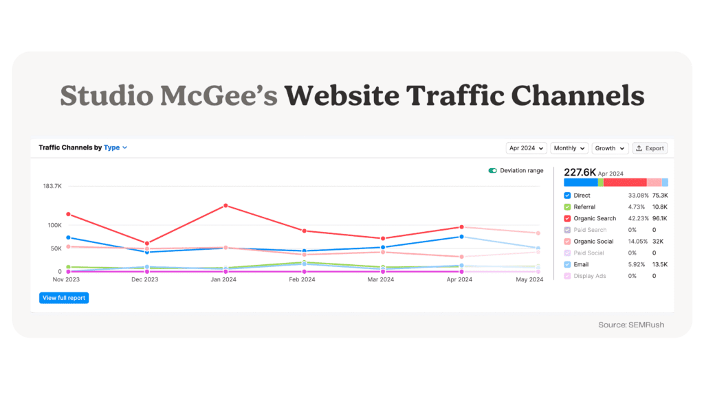
In April 2024, the website saw 227,600 visits, of which 42% came from organic search (mainly Google), 14% from organic social (mostly Pinterest), and 33% from direct traffic.
There isn’t public data suggesting how much revenue the website generates, but we can estimate. I will use the most conservative numbers possible for the design side (and the smallest part) of their business.
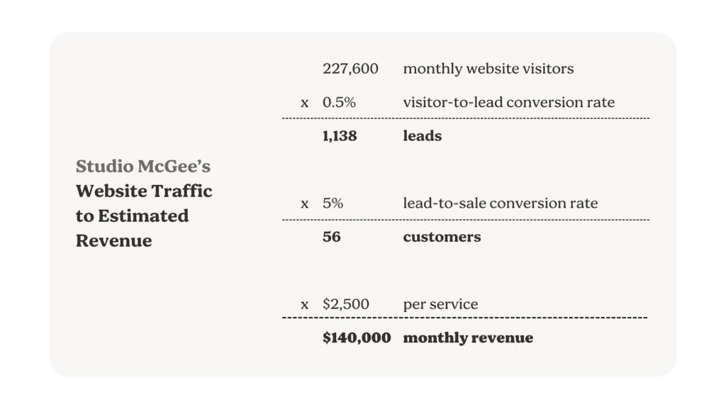
A good website visitor-to-lead conversion rate is 3%. For Studio McGee, let’s use 0.5%. With 227k hits in April and a conversion rate of 0.5%, we can estimate they received 1,138 leads.
227,600 monthly website visits * 0.5% conversion rate = 1,138 leads
A solid lead-to-sale conversion rate is about 20%. Let’s be mega-conservative and use 5%, bringing us to 56 estimated customers.
1,138 leads * 5% conversion rate = 56 customers
Studio McGee’s lowest package is $2,500 for virtual design services. Multiply that by 56 customers a month, and we can estimate that the website drives about $140,000 in monthly revenue.
56 customers * $2,500 per service = $140,000 monthly revenue
If my estimates are correct, this new website isn’t just a digital brochure of Studio McGee’s work. It’s working for them. Designed with search engine optimization (SEO) and conversion rate optimization (CRO) in mind, the website is marketing and selling itself.
In an interview with Business of Home, their investor Kevin Chen from Strand Equity said 51% of customers are repeat. “[The McGees’] repeat and reorder metrics were very impressive.” All the more reason to believe the website is working.
Studio McGee’s Marketing Strategy
How did the McGees do it? While they may look like overnight successes, their marketing strategy has been anything but. I’d break down their marketing strategy into three principles.
1. Personal Branding Turns Strangers Into Loyal Customers
When I started my marketing career, I thought branding was fluffy. Only a few know how to define it, and even fewer can measure it. Then my friend Louis said something that changed my mind. “I trust and like people that put their face on the homepage. You only do that if you take pride in your work,” he said.
It’s true. Anyone can hide behind a logo or stock image, but not everyone has the guts to put their face on their work. Shea McGee, on the other hand, puts her name and face on everything.
Since day one, McGee hasn’t been shy about taking videos on job sites explaining her process or photos of herself in front of finished projects. Some are unedited, some are professional, but she’s always consistent. All those years of recording Instagram Stories day in and day out created a loyal following and prepared her for bigger platforms. Now, she has a Netflix series, two published books, and a licensing partnership with Target—all with the McGee name and face.
It’s not because she’s obsessed with herself. It’s because it converts online strangers into paying customers.
The more we see her, the more familiar she becomes. The more familiar she becomes, the more we like her and are prone to buy from her. In consumer psychology, this is called the Mere Exposure Effect or principle of liking.
By creating a brand, McGee is creating familiarity among prospective customers. With fair skin, blonde hair, blue eyes, and a family name that starts with “Mc,” she is also quintessentially American, which gives her more familiarity points.
It shows in the numbers. About 80% of their organic website traffic comes from branded searches, while 20% comes from non-branded.
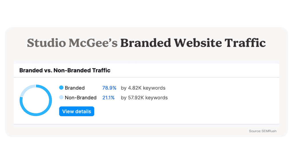
That means 80% of website users have gone to Google specifically searching for “McGee.” People are searching for McGee kitchens, bathrooms, velvet ornaments, fireplaces, stools and heck, even McGee teeth!
2. Bring Readers Behind-the-Scenes Through Content
With nearly 50 projects on the website, Studio McGee has turned most of them into “project tours.” Through videos and photos, they document each project’s before, during, and after and turn them into marketing material.
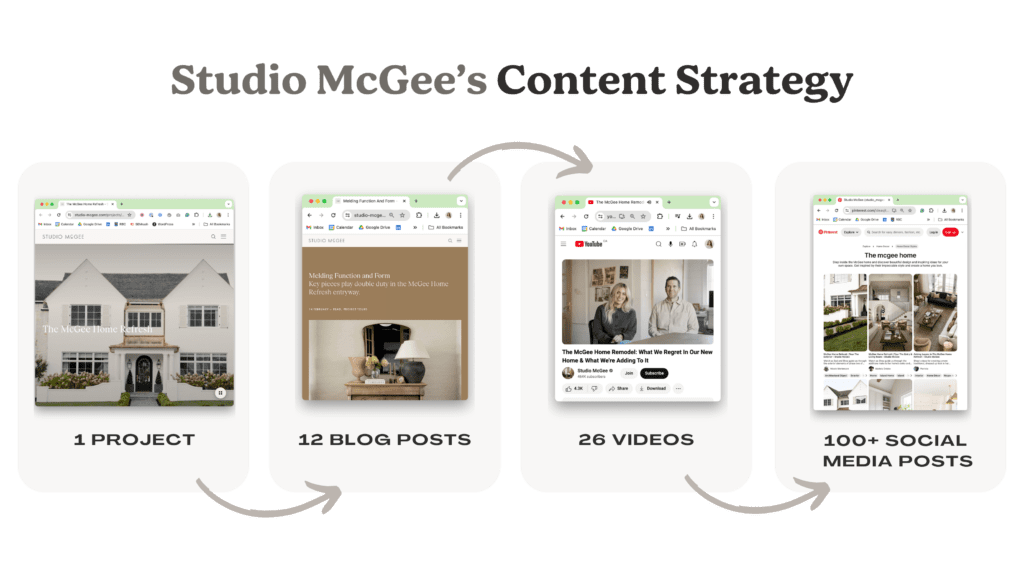
Take the McGee Home Refresh project as an example. They turned this project into 12 blog posts, 26 long-form videos, and—I lost count—probably hundreds of social media posts.
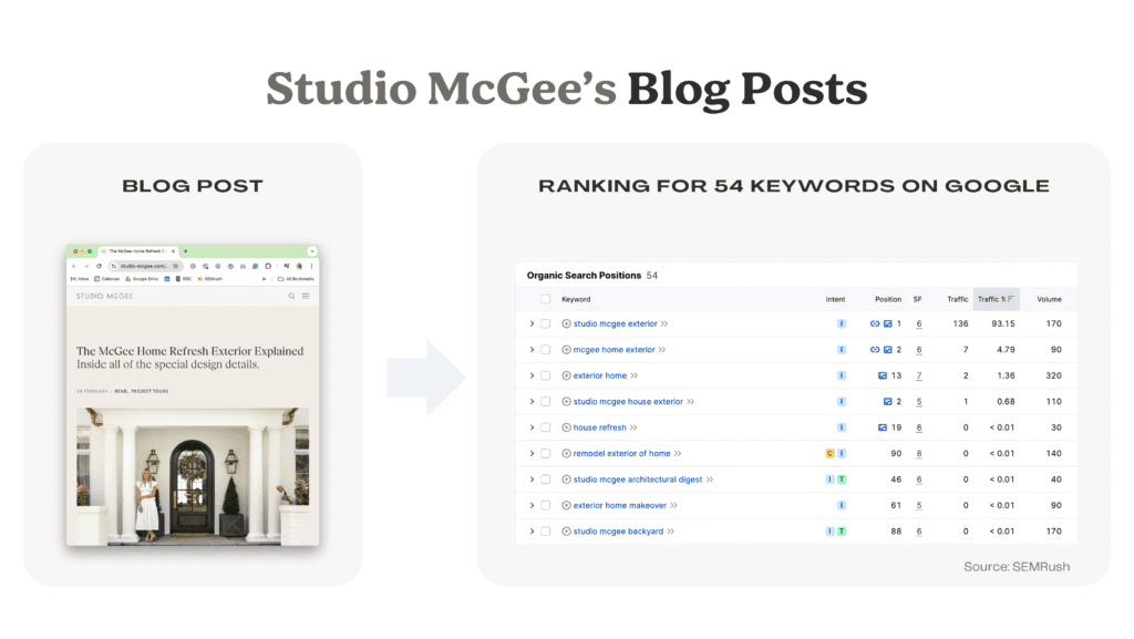
Moreover, they’ve optimized each blog post for Google and Pinterest. For example, this blog post, The McGee Home Refresh Exterior Explained, ranks for 54 keywords, including “mcgee home exterior” and “home refresh”.
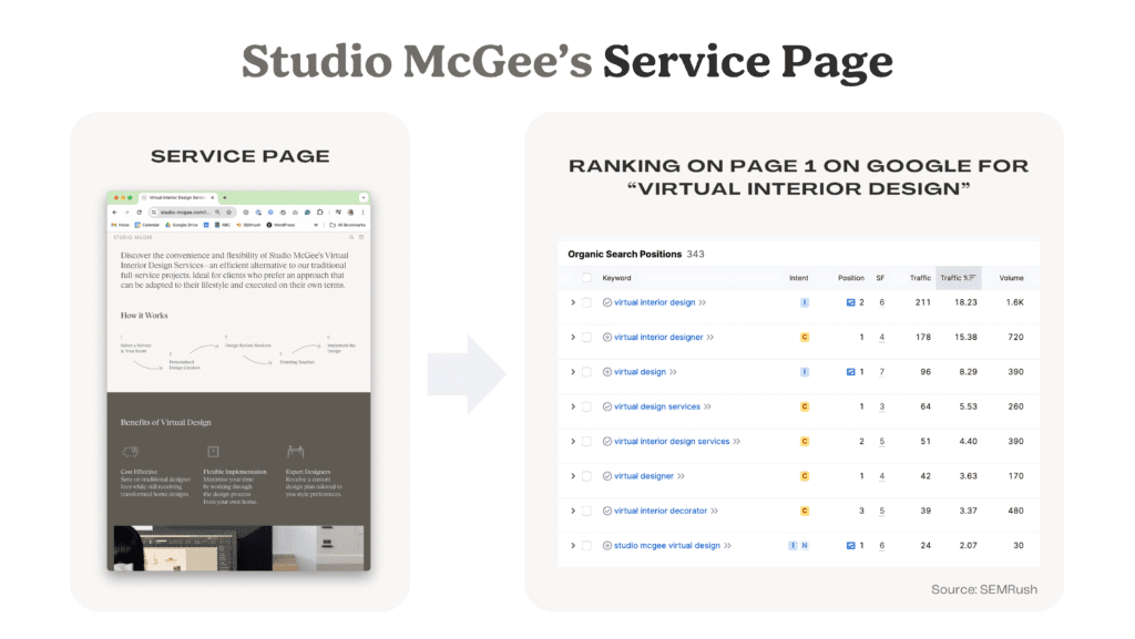
Another excellent example is their service pages. There are two pages (one for full-service and another for virtual design), each with about 500 words of copy and illustrations to describe the process and answer FAQs thoroughly.
The landing page, Virtual Interior Design, is my personal favourite. As a marketer, I see how they used thoughtful copywriting and design to optimize the page for search without it reading robotic or fluffy.
And it shows in the data. According to SEMRush, the page …
- Ranks for a total of 343 keywords
- Drives 1,300 hits a month
- Appears number one on Google for the keyword “virtual interior designer” across the entire USA.
This single landing page simultaneously attracts filters, and converts potential clients.
We do this kind of “behind the scenes” content strategy and thoughtful approach to SEO for all our clients, and I wish more design firms would follow suit. It is brilliant for two reasons.
First, stories communicate value and expertise.
Most design firms have photo galleries as portfolios, with little to no text. The problem? By looking at photos alone, I don’t know if you tore down a wall or added pillows.
Studio McGee’s portfolio, however, tells stories—a lot of them.
The studio educates the public on design by peeling back the curtain and taking readers through the process. Through their content, readers can understand the difference between a decorator and a designer and the value of a well-designed home. In turn, the McGees have positioned themselves as experts worth paying a premium for.
Second, today’s projects attract tomorrow’s.
The projects Studio McGee documents and markets today attract the projects of tomorrow. Every project markets the next. In marketing, we call this positioning or the marketing flywheel (I wrote about it here).
Shea McGee started renovating her own home in 2014 and documented the process for two years. Her content highlighted her signature style, which attracted customers who appreciated and wanted the same.
Looking at her portfolio, you can see similarities. McGee’s projects are typically Utah-based, full-home renovations with a modern aesthetic, light and airy colour palettes, and organic textures—or, as she often says, “relaxed but elevated.”
The more content she puts out, the more similar projects she attracts. Studio McGee uses their website to sell without pitching.
3. Don’t Just Show, Sell
In the early 2000s, designers and architects used websites to replace brochures and pamphlets. Websites were where your professional photographs lived, and they were an efficient way to show potential clients, ones you had already spoken to, your work. But they didn’t replace a sales pitch, and they certainly didn’t bring leads to you.
Those days are long gone. Or at least they should be.
Nowadays, websites can sell for you. Using copywriting, conversion rate optimization (CRO) and UX design, websites can persuade visitors to book a call or add to cart. The McGees designed the new website to do just that.
Wherever you find yourself, Studio McGee’s website isn’t shy about making the ask. Through blog posts, they feature and promote products from their e-commerce. This blog post, A Guide to Light Fixture Hanging Heights, includes three tips for hanging light fixtures and features nine products from the McGee & Co e-commerce.
On portfolio pieces, they include a form to book a consultation for their design services.
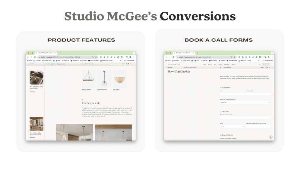
Like an Ikea maze, the McGee website takes users through a specific journey designed to end in a sale. Even with a conversion rate of as little as 0.5%, these subtle CRO techniques generate millions for the company.
You vs. Studio McGee
Now it’s your turn. Here are three quick and dirty tricks you can use on your marketing strategy, just like the McGees.
- Turn your projects into content. Photos aren’t enough, tell the stories behind them. Document the process. Use stories to explain the value of interior design.
- Create a service page. Share your process. Answer FAQs. Optimize the page for Google.
- Make it easy to book a consultation. Place contact forms throughout your website to filter and convert website visitors.
But also remember you’re not McGee.
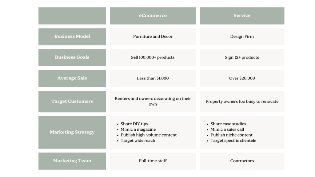
Studio McGee isn’t just a design firm anymore. Today, they’re predominantly an e-commerce company with 140 employees. They’re in the business of selling volume (i.e., a lot of products at a four-figure or lower price point) and their content strategy reflects this. Their website’s blog functions more like a magazine. They publish a high volume of content on a wide range of topics, from coffee table styling tips to meatball recipes.
If you are a service firm, you’re probably looking for fewer but quality projects, ranging from $20,000 to $1M+. So, where McGee’s is all about volume and casting a wide net, you must focus on creating highly targeted and tailored content. Think of your blog more like a salesperson. It should anticipate and answer your customer’s most pressing questions to prime them to purchase once you get on a consultation call.
Of course, figuring out exactly what kind of content you should create that checks all those boxes — and then writing and publishing it — is easier said than done. Fortunately for you, that’s exactly what my firm, Findable, does for our clients.
So, if you’re ready to turn your website into a 24/7 sales channel like Studio McGee’s, book a call with us. We’d be happy to help you level up.


